How I designed United We Chess


This was my second ever Game Jam, which I almost didn't take part in due to that I work weekends. If I had not managed to trade Saturday with a co-worker, United We Chess wouldn't have been a thing.
It's there this journey and decision-making starts.
As I were at work when the Jam started, so I had my wife text me the theme, giving me a few hours where I couldn't do anything but plan out the game. I bounced around a few ideas, but the Chess idea came back and refused to leave. It was also something I felt like I could accomplish in time, despite having never made a Chess game or turn-based game like this before. In fact, after figuring out the main mechanic, I figured out how to do movement. I'm so glad my job isn't mentally challenging, allowing me to keep those ideas in my head.
Okay, so I'm a creative person. I have 2-ish projects going at all times while writing ideas down for a third. At the moment, I'm designing board games, and the focus on clear, simple rules and clearer visuals did influence the game. Chess, after all, is a very famous board game, allowing me to get more complex, banking on the knowledge that people either know the base game, or can easily figure it out.
My main goal was to simply finish a game. I have a nasty habit of starting projects, but stopping either because something better comes along, or I run out of steam, sometimes even when the project is 95% complete. Adding a computer player to the game was something I filed under "if I have time. It'd be cool, but it's not needed". So I did accomplish everything I set out to do. Maybe there'll be the computer player in an update unless I start working on something else...
Now, it's important to know why you are doing what you do, and this game is no exception.
I'll be presenting the actual decisions and reasonings in bullet list form, because writing comprehensively is hard, but before then, I'd like to note that most of these decisions either came about during pre-production (work plus the hour it took to get my pizza from the local pizza place) or minutes after implementing the thing. The lesson there is to just start doing, things will fall into place eventually.
Anywho, the list:
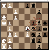
- Colours. There are three levels of brightness in the game: 100% (white), 0% (black), and hovering around 50%. Specifically, everything that's not belonging to a player is in the 50% as to allow you to see all pieces easily. For this reason, a background colour that doesn't hide colours, such as yellow even at 50% brightness, was picked. Brown/beige is a common board colour, and for that reason.
I briefly toyed with the idea of randomising player colour, with the other player getting the opposite (e.g. blue vs orange, green vs purple), but I quickly realised that I had no idea how to do such as thing, and it wasn't necessary.
- Sides. You'll notice that unlike most Chess games, white is on the left instead of bottom, and black is on the right instead of top. Since I knew I was designing for hot seat gameplay from the start, it made more sense. Putting white at the bottom—"closer" to the player—makes sense in a physical version of the game, but for this I can't give either side a bias. If I were to add the computer opponent, the board would be rotated so you get to be whatever colour is at the bottom.
- Messages. Here's a feature existed very early in the development, but is now gone. Well, technically gone. It's still in there, but just below the game screen. The idea was to use text to inform players about what's going on, such as who's turn it is and what you need to do (select your first/second piece, where to move, etc.). It was scrapped partly because the fact that you can learn the mechanics really easy and don't need to be barraged by messages of who's turn it is (I made the background change colour to indicate that, anyway). Again, I can trust that you aren't an idiot, and if the game is too complicated, I've failed this Jam.
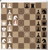
- Movement. So how the pieces would move wasn't that hard. "Just like in Chess, except now you move two. The second piece follows the first, and it can influence how far the other can go". However, I needed to differentiate movement from the primary and secondary piece. Circles. Done. Bigger circles for the more important primary piece. Smaller for hte secondary. Bonus points that the smaller fits into the larger.
I toyed around with making the whole tile glow, but it occurred to me that with half-transparent squares would cause similar problems to the 50% yellow issue mentioned above. In fact, even the circles had some transparency, which made it harder to track.
One thing I'd add to an update, which I figured I could add as I was running out of time, was that if you hover over a tile, that and the matching tile for the other piece would light up a bit, making it even more obvious what your movement would do.
As for the physical movement, I knew from the get-go that I wanted to see the pieces move. I've seen Chess games where the pieces simply teleport, which is fine when you decide where they teleport, but not when the computer does it, meaning you have to figure out what just happened. Solution? Slide the piece. And if it takes an opponent's piece, you'll see that as well. Feedback is important.
- The name. So the original name for this game was going to be either CHÆß, or Cheß (the German double s), indicating the concept of linking. I'm glad that didn't happen. The name revision came when I was talking to my Mother-In-Law about the name, and as I'm about to bring up the name, I come up with "either 'United We Chess' or 'United We Stand'". She liked United We Chess better, as it explains the game much better than the other. I agreed. Either of the two, it also lends for what I feel is the very satisfying message for one of the victory conditions: Divided they fall. Which, surprisingly, was already in the game at that point. Speaking of which...
- Gameplay. I personally felt like the game catered to the Jam's theme pretty well, including the part that I noticed few games used from Mark's theme introduction video: "What does it mean for them to be joined? What does it mean for that connection to break?"
Someone in the comments asked for a version where you can play Chess normally, but have the link mechanic be optional. This was never my intention, as having a piece by itself (divided) was intended from the start. There were other games submitted to this Jam that did allow you to play Chess normally if you chose, but having what should be the main idea be optional didn't feel like good gameplay (a lesson I've learned from my board game design side). The fact that Game Jams let you get away with crazy experiments help, too.
This section is not to riff on the other Chess game submitters, this is just me saying why I did what I did.
- Menu. I got no crazy stuff or decisions for this. I was running out of time and had to throw something together. Making the menu took surprisingly long time, even if I knew what I wanted to do. I'd definitely spruce up the "How to play Chess" section. This being a Jam game, I had to make sure you understand the controls from the start, so the controls is the very first thing you see when you start the game. I've seen a lot of people put the controls on the game page, but not in the game. I think this is a mistake. You can't expect that people will start the game from the game page.
- The whole piece. One thing I do when designing games is to consider the whole picture. How will the art affect the gameplay? Can I break the game by doing this? Is chaining adjacent pieces together even a good idea (no clue, but I don't have the time to find out!). This is also something from the board game design side, where if you make a card for a game, you have to consider how that card can be used, and how other cards/mechanics can use it. I designed The Box for Tabletop Simulator (give it a look), in which its ridiculous amount of content had me consider combos and interactions from the most disparate parts of the game, making sure one card can't break something elsewhere in the game.
In conclusion, I think I knew what—and why—I was doing when I was doing it.
Knowing me, I've probably missed something in this rant, but I love to answer questions and comments, so if there's something you'd like to know about regarding this game, leave a post. This game design journey is meant to be shared, and remember: Learning from your mistakes is good, but learning from the mistakes from others is even better!
Really though. Imagine it being called CHÆß.
Files
Get United We Chess
United We Chess
Divide and conquer in this twist on Chess
| Status | Released |
| Author | SilversMind |
| Genre | Strategy |
| Tags | Casual, Chess, Game Maker's Toolkit Jam, Local multiplayer, Multiplayer, Short |
Leave a comment
Log in with itch.io to leave a comment.